
THE CHALLENGE
Stagnant traffic and limited unique visits on the transaction dashboards of a bank
WHY
Transaction analytics platform of a bank is reported to be underutilised
WHAT
Identify areas where UX intervention is required to increase engagement with the platform
HOW
Heuristic analvsis for a usability assessment
OUTCOME
Root cause analysis for platform underutilisation
Low fidelitv
wireframes for the new dashboards to increase avg. scroll depth
WHAT DID THE CLIENT ASK FOR?
I conducted this proactive usability testing for a transaction platform of a bank that had been for long a loyal client of HCL. The intent was to use this research as a 'thought piece' to redesign the platform and monitor its performance and adoption.
MY ROLE
Team of 3. This research was planned and completed in 4 days. I was responsible for stakeholder management, research design and for supervising the wireframe development. Key tasks were:
1. Suggesting the applicable Heuristic methods for conducting a quick usability assessment so that we can get enough pointers to redesign this.
2. Suggesting a user research method to design approach
3. Creating a low fidelity wireframe for better engagement
Guerrilla testing and 5 Second test was conducted focusing on understanding the main parts of the dashboard that people could recall. This along with surrogate empathy provided key attributes to do a broad level card sorting. Additionally, a cultural contextual model was developed based on the prototype-personas of the stakeholders. The data for these proto-personas was gathered from secondary research and previous projects done with the client.

A challenge I faced while developing the proto-personas was lack of enough informations from the users to understand why they do not use the dashboards. This proactive research was happening alongside 2 ongoing billable projects. So gathering primary data to understand usage barriers was a an added problem

Therefore to segue, I decided to rely on secondary research. Utilising Pisal Yenraadee's- Framework for Developing a Banking Performance Dashboard, I did an attribute benchmarking


Based on Yenraadee's framework, Nielson's principles for interaction design, and Eight golden rules of interface design certain UX concerns were highlighted. Mitigation of these concerns was phased to be prioritise the low hanging fruits for the purpose of the moment [which was to be interest client in commissioning an end to end platform redesign project]


Please note, I could not put the screenshots of the existing dashboard because of the sensitive data it contains.


First step was to create a wireframe sketch. I did this on Google slides while I was collating the heuristics. Key pointers from this low fidelity wireframe were picked to design the final wireframes. I designed three screens on Figma.
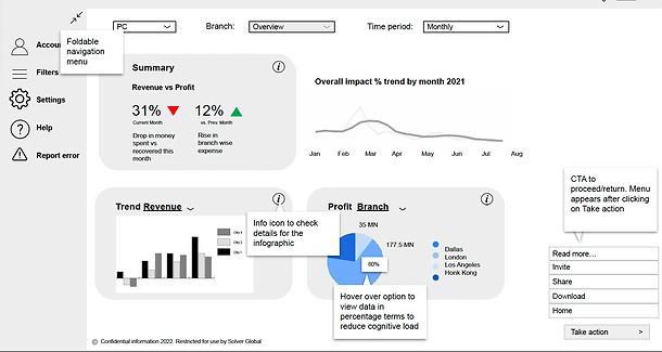
An overview/Home Screen [Landing page]
It had thumbnails to the key sections the users are expected to check. Additionally, it has the everyday sales and performance summary that can be sliced by duration/region. It allows users to change screen resolution as per their device. It also has tooltips to assist new users

Branch analytics screen [Product description page]
This screen gives an insight into how detailed sections of the dashboard might look like. It allows users to select custom duration, and metrics to check transaction details. It also allows users to download, and share reports via email or raise a query

Complaints analytics screen [Product description page]
Complaints analytics was covered here because it is one of the services HCL has been providing the client. The idea was to bring this up again and discuss scope for extending this work stream

Following evaluation tools were used to examine the findings

